Wolf vs Goat
A brand built for the fabric.
Wolf vs Goat sells men’s apparel cut from Italian-made cloth, at a price point that asks a visitor to take the brand seriously before they have touched anything. The garments carried that weight. The storefront did not.
The site read like a conventional Shopify shop: fabric treated as a filter rather than the reason to buy, campaign photography shown at card size, and collections stacked as equal rows with nothing sequencing them. The redesign was not about making the store prettier. It was about closing the gap between how the product was made and how it was presented.
My role
Design and Shopify build. The brand identity was already established by the client; this was a redesign of the storefront around it, covering art direction, interface, collection architecture and product presentation.
Every choice traceable to a reason.
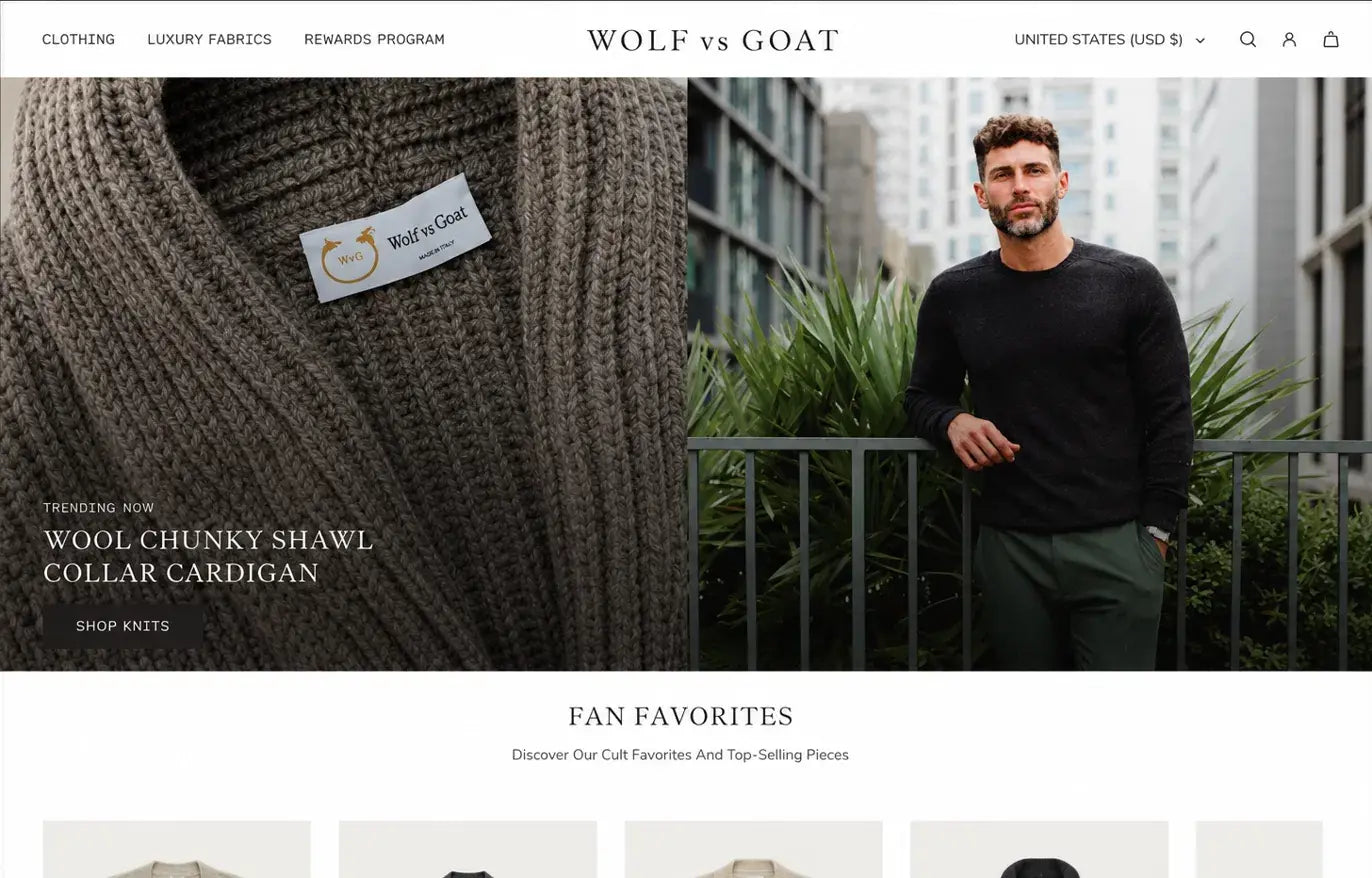
Split-screen hero
A fabric close-up beside a lifestyle frame. One image proves the material, the other supplies the aspiration. Neither does both jobs alone.
Fabric as navigation
Luxury Fabrics sits in the top-level nav rather than inside product copy. It states what the brand sells before a visitor clicks anything.
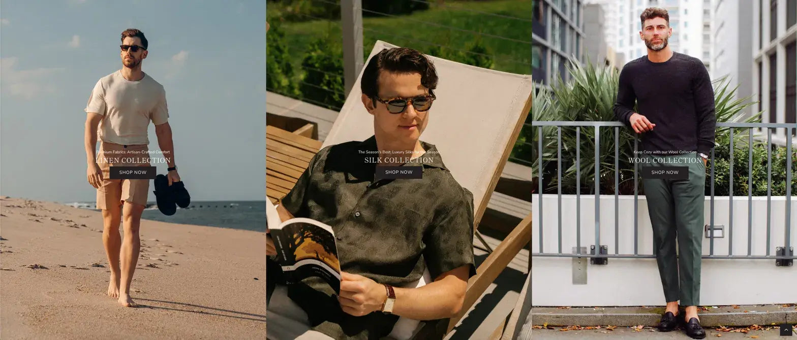
Collections given hierarchy
Linen, silk and wool were treated as three distinct worlds with editorial space each, instead of three equal rows in a filter list.
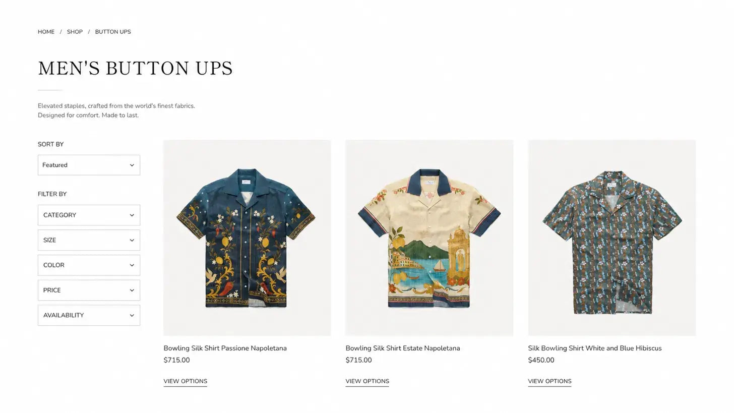
Restraint around the product
Clean ground, generous padding and a product-centred grid. Small, widely spaced type makes the photography read larger and more expensive.
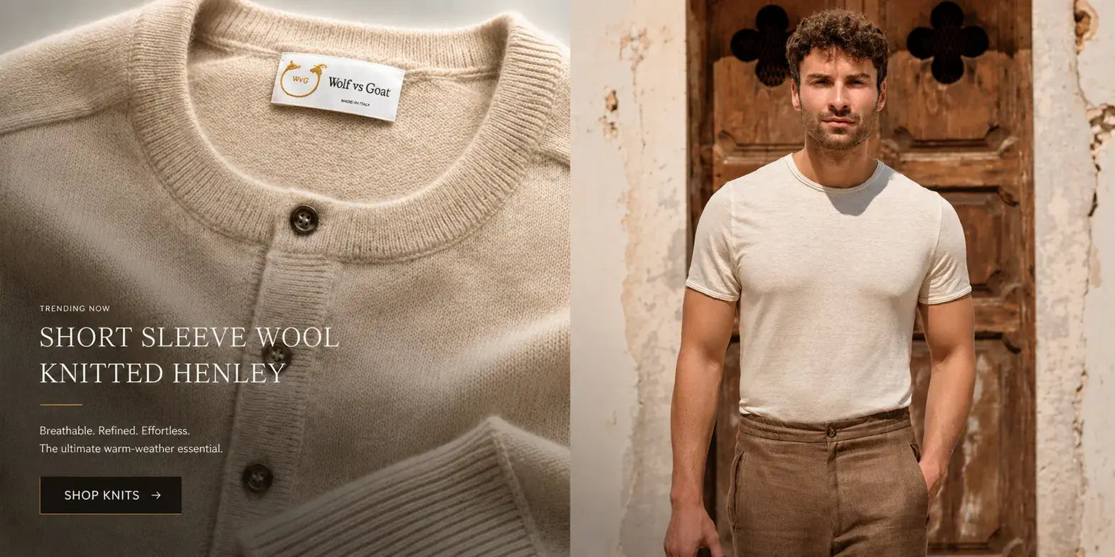
Specific calls to action
Shop Knits rather than Shop Now. Naming the thing keeps the editorial voice intact all the way into the commerce layer.
The redesigned storefront.
A homepage that leads with cloth
The trending piece is introduced by a close-up of its knit, with the Made in Italy label legible in frame, before any product card appears.
Collections with editorial scale
Each material collection gets full-bleed treatment, so choosing between linen, silk and wool feels like choosing between wardrobes rather than filtering a list.
A product grid that gets out of the way
Even spacing, a quiet ground and consistent crops. The garments carry the visual weight because nothing around them competes for it.
Campaign photography, finally at size
Imagery that had been running at thumbnail scale was given room to work, so the brand communicates before it asks anyone to shop.
What the redesign actually covered.
Shopify redesign on the Capital theme
Homepage, collection and product templates rebuilt around the new structure rather than restyled in place.
Collection architecture
Material-led collections defined and sequenced, with navigation restructured to match how the brand actually sells.
Art direction for existing assets
Campaign photography already shot by the client was re-cropped and re-scaled for editorial placement across the store.
Interface refinement
Header behaviour, hero cropping, icon weight and call-to-action treatment worked through across several rounds of client review.
These images show the website as delivered by Bareblink Studio. The live site may have been updated by the client since completion; any changes beyond that point were made independently.
What worked
- Putting the material into the navigation rather than the product description made the brand’s single biggest differentiator impossible to miss.
- Rebuilding the templates around a structure, instead of restyling the existing ones, meant later changes stayed consistent without rework.
- Keeping interface type small and widely spaced let the photography carry the premium signal, which is cheaper and more durable than saying the word luxury.
What I would do differently
Let’s scope yours.
Tell me about your project and you will get a preliminary range in a few minutes, with no call required first.
Get a quote