Studio Sivan
Built for the brand before the brand existed.
No website. No template. No compromise.
Studio Sivan is a NYC womenswear label built around dark femininity, flowing silhouettes, punk textures, studded details, and campaign photography that feels more like a film still than a product shot.
They had the brand, the garments, and the imagery. What they didn't have was a digital home that could hold all of it without flattening it. A generic Shopify theme would have killed the energy before a customer ever scrolled.
The challenge was building something from nothing that felt like it had always existed, a site as considered as the clothes themselves.
The challenge
- Starting from zero. No existing site, no brand guidelines, no visual system to inherit. Every decision had to be made from the ground up, and every decision had to feel intentional.
- Protecting the photography. Studio Sivan's campaign imagery, shot on location across NYC streets and galleries, is the brand's strongest asset. The site had to frame it, not compete with it.
- Dark aesthetic, clean commerce. A dark, editorial brand identity and a frictionless shopping experience are often in conflict. The site had to be both, atmospheric and functional.
- Communicating the price point. Garments priced $350–$775 need a site that earns that number on sight. Everything, spacing, typography, image scale, had to signal investment before checkout.
My role
Creating the first-ever digital presence for a NYC womenswear label built on dark femininity, punk silhouettes, and unapologetic edge.
Every choice traceable to a reason.
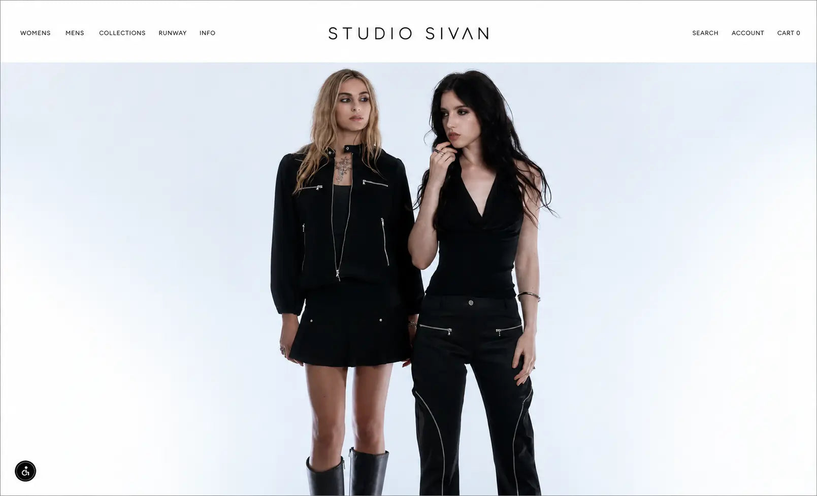
White nav on white
The navigation sits above the hero image in clean white, unobtrusive, invisible almost. The brand name reads before anything else. No visual competition with the photography below it.
Full-bleed hero
No padding, no border, no container. The campaign image runs edge-to-edge. This is a deliberate choice: luxury fashion sites don't frame their photography, they let it breathe and command.
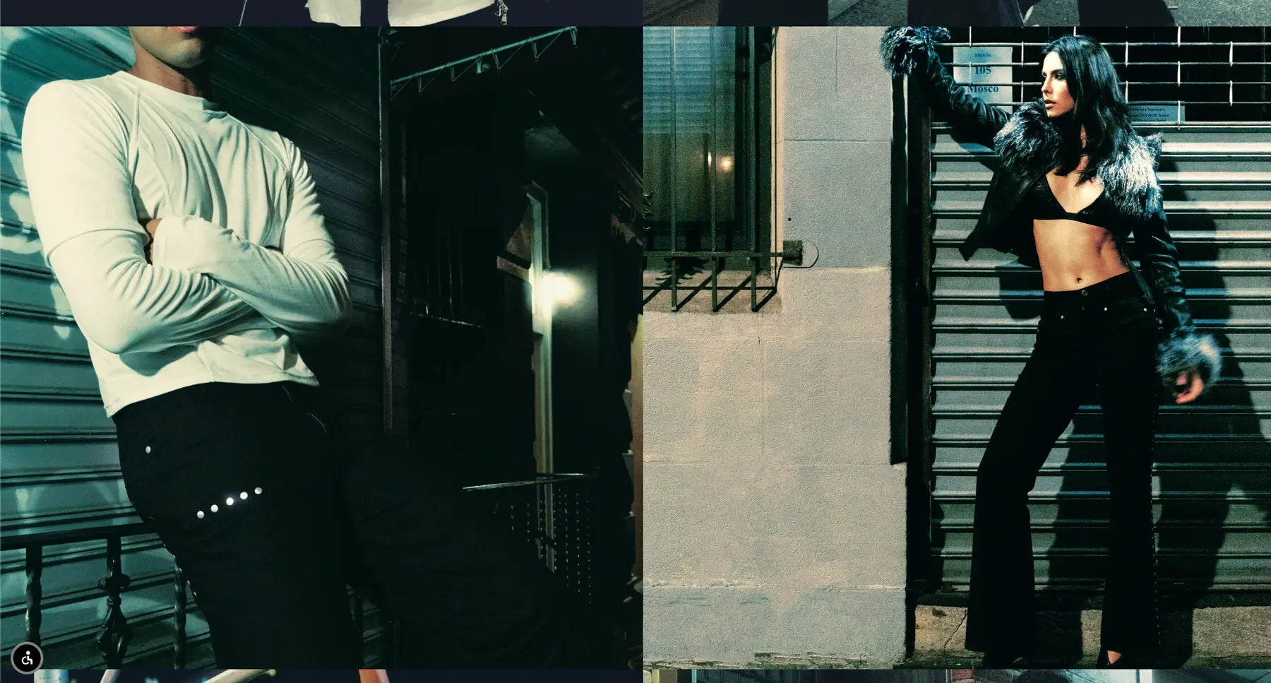
Split-screen editorial
Campaign sections use a two-panel split, two worlds in one frame. This mirrors how the brand thinks about its customer: not one aesthetic, but a tension between edge and elegance.
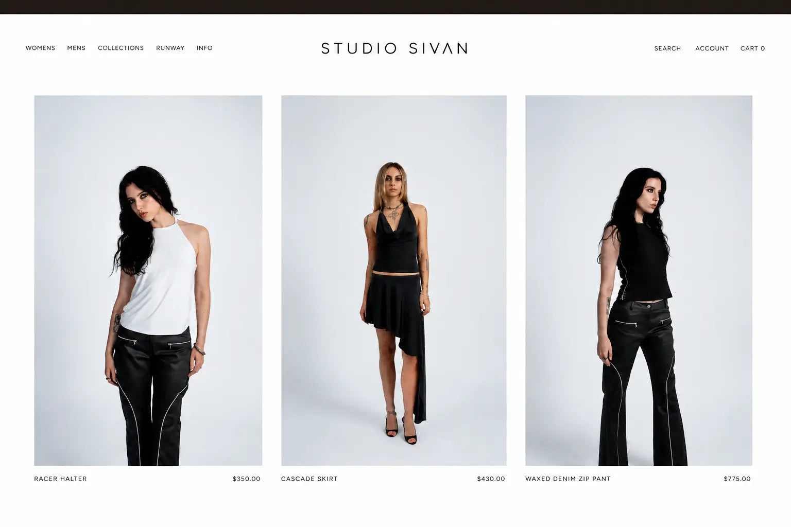
Product grid on grey
A neutral grey ground for product photography. Not white, which reads clinical, and not black, which competes with dark garments. Grey creates depth without distraction.
Spaced all-caps labels
Product names and prices in all-caps, letter-spaced at 0.1em. This typographic choice turns a product listing into something closer to a placard. It elevates without shouting.
Minimal nav structure
Womens, Mens, Collections, Runway, Info. Five items, everything the brand needs and nothing it doesn't. The "Runway" nav item positions Studio Sivan as a label with a show, not just a store.
The work.
Homepage, above the fold
Full-bleed campaign imagery, centered wordmark, editorial restraint
Product grid, Womens
Grey ground, full-height editorial product photography, spaced labels
Campaign editorial, NYC locations
Split-screen tension between motion and stillness
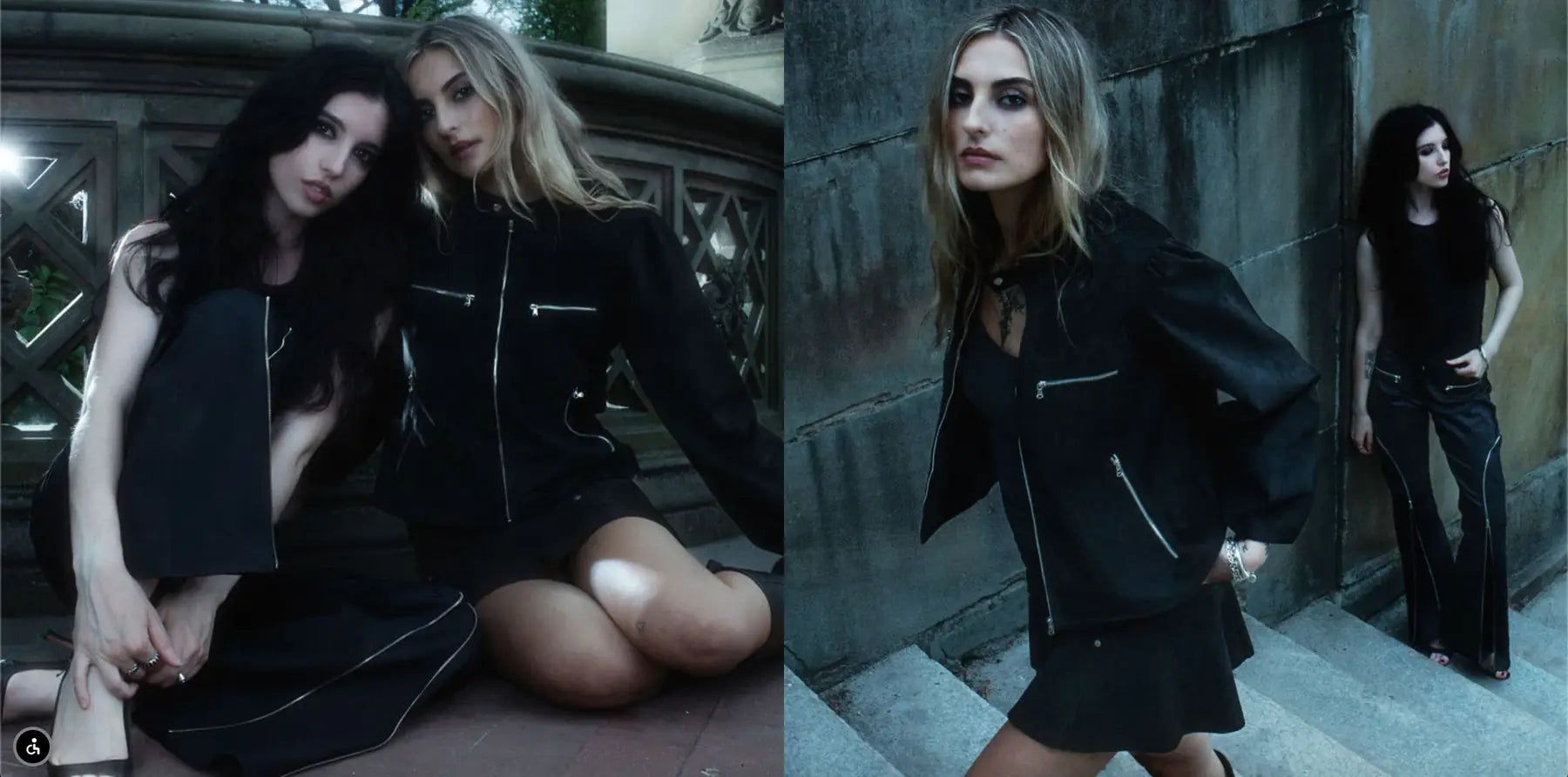
Runway editorial, Dark femininity campaign
Low-light, architectural, cinematic
A digital world that matches the physical one.
Zero to live, no compromise
Built entirely from scratch without defaulting to a generic theme. Every section, every spacing decision, every typographic choice made to match the brand's energy.
Photography given room to breathe
Campaign imagery runs full-bleed and edge-to-edge throughout. The site enhances the photography rather than containing it.
Commerce that doesn't feel like commerce
The shopping experience is seamless without being sterile. Products at $350–$775 sit in an environment that justifies the investment before a customer adds to cart.
These images reflect the website at the time of delivery by Bareblink Studio. The live site may have been updated by the client since project completion. Any changes beyond this point were made independently.
Let’s scope yours.
Tell me about your project and you will get a preliminary range in a few minutes, with no call required first.
Get a quote