Sowaka
Where Japanese heritage meets mindful living.
Japanese beauty deserved a platform as considered as the products it carries.
Sowaka is a NYC-based clean beauty retailer curating Japan's most intentional skincare, haircare, body care, and lifestyle brands, Leaping Bunny certified, botanically sourced, rigorously tested. The kind of beauty that treats the ritual as seriously as the result.
They needed a site built from zero that could hold a multi-brand catalogue without losing the coherence of the platform's own identity. EDOBIO's vegan minimalism sits next to Ruhaku's botanical depth next to Dassai's ceremonial restraint. The site had to unite them under a single editorial vision.
The result had to feel like an edit, not an inventory.
The challenge
- Multi-brand catalogue, single identity. Sowaka carries brands with distinct visual worlds. The site had to curate them under one editorial voice without flattening what makes each brand distinctive.
- Communicating the clean beauty proposition. Leaping Bunny certified, responsible ingredients, botanical power, six brand promises that needed to feel like convictions, not marketing claims.
- Depth without overwhelm. Seven nav categories across multiple Japanese brands. The information architecture had to guide discovery without friction.
- Brand features within retail context. Ruhaku, EDOBIO, Dassai each needed editorial spotlight sections, not just product tiles. A flexible feature template the site could repeat across brands.
My role
Building the digital retail experience for a NYC-based clean Japanese beauty platform carrying some of Japan's most considered skincare, haircare, and lifestyle brands.
An edit, not an inventory.
Wave-cut section dividers
An organic wave-cut transition between the hero and the bestsellers grid, not a hard line, not a gap. A distinctive visual signature immediately recognisable across the scroll. It softens the retail beneath without hiding it.
Brand promise icon system
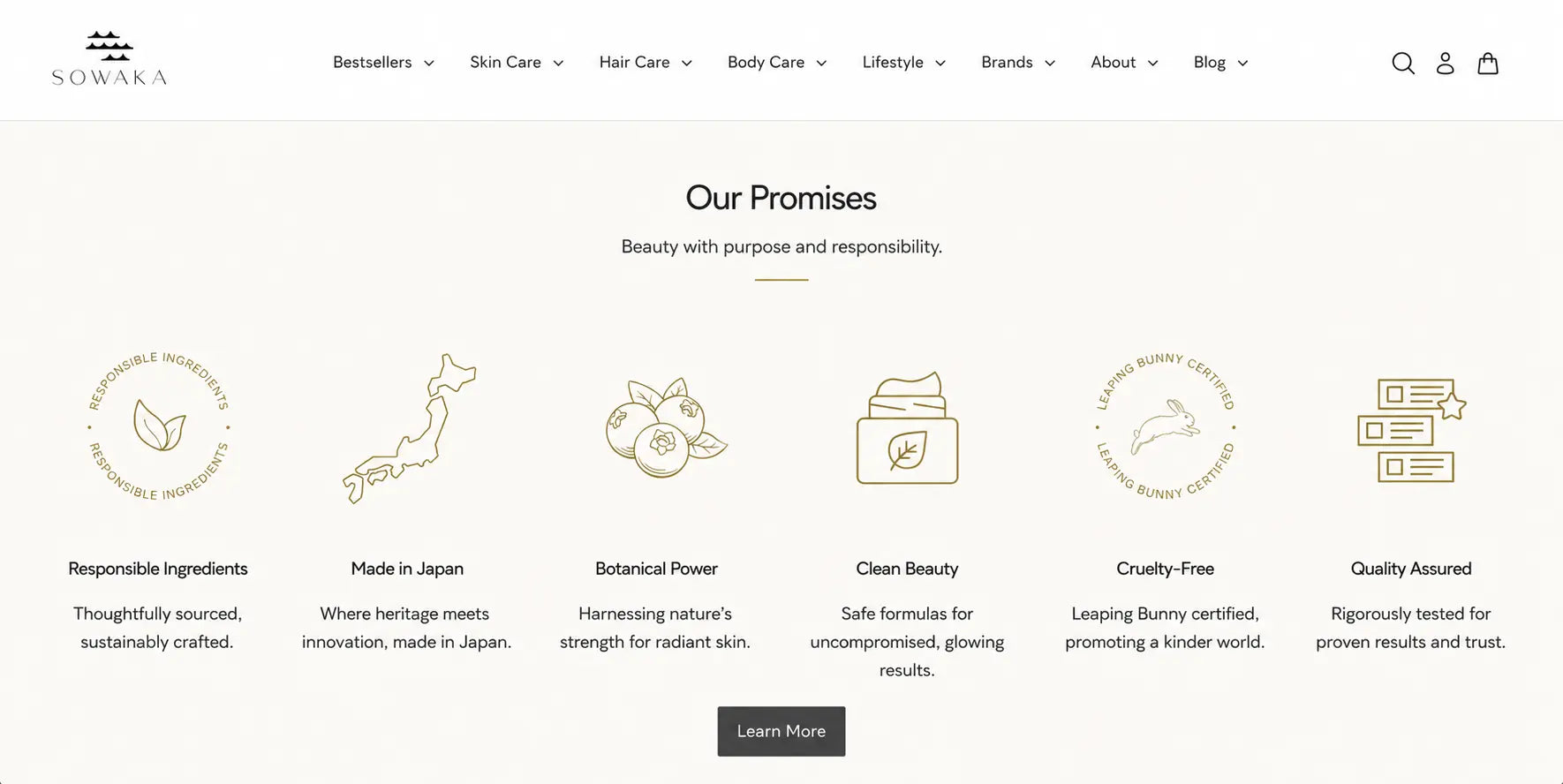
Six gold line-drawn icons, Responsible Ingredients, Made in Japan, Botanical Power, Clean Beauty, Cruelty-Free, Quality Assured. Circular motifs, consistent weight, warm gold tone. A complete visual system communicating the platform's values before a word is read.
Dark editorial brand features
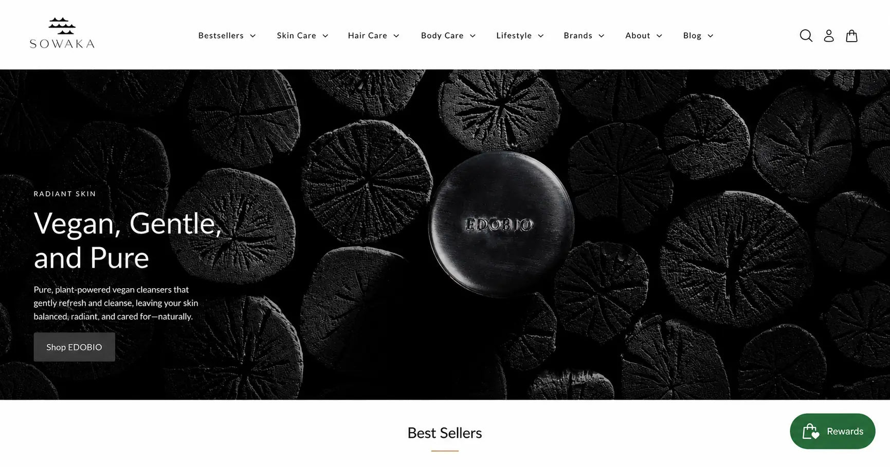
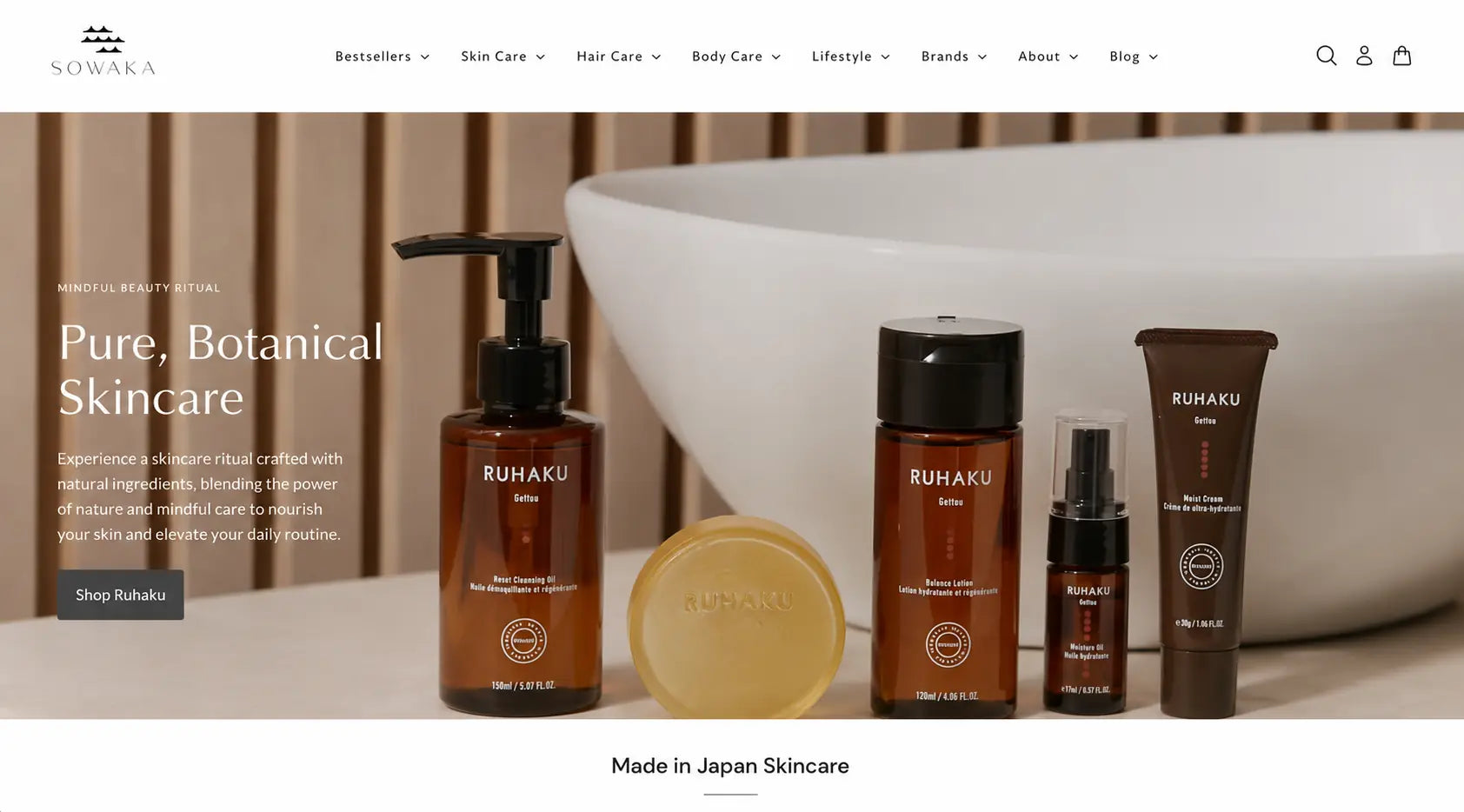
Each partner brand gets a full-bleed dark hero section, complete visual contrast from the clean white catalogue pages. EDOBIO on black. Ruhaku on warm stone. The dark treatment signals: stop browsing, pay attention.
Gold accent system throughout
Warm gold runs across the full site, section header rules, product badge backgrounds, promise icons, CTA grounds. One accent colour doing more structural work than most sites achieve with five.
Product badges as editorial labels
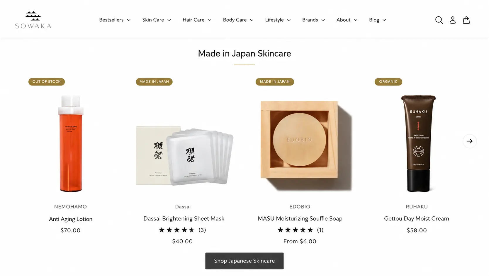
"Made in Japan," "Organic," "Out of Stock", gold pill badges on every product tile. In Sowaka's system these are editorial endorsements, not filter tags. The gold makes them feel like a curation mark.
Lifestyle as a nav category
Bestsellers, Skin Care, Hair Care, Body Care, Lifestyle, Brands, Blog. "Lifestyle" positions Sowaka as more than a beauty shop. The Kunjudo incense collection lives under Lifestyle, because incense is ritual, not skincare. That distinction in the nav is brand strategy.
The work.
EDOBIO brand feature, Vegan, Gentle, and Pure
Full-bleed dark editorial, tactile product photography
Ruhaku brand feature, Pure, Botanical Skincare
Full-bleed product photography, editorial copy, brand CTA
Made in Japan Skincare, product grid
Gold badge system, multi-brand curation, $6–$70 price range
Our Promises, gold icon system
Six brand values, custom line-drawn icons, "Beauty with purpose and responsibility"
A multi-brand platform that feels like a single point of view.
Multi-brand coherence achieved
EDOBIO, Ruhaku, Dassai, three visually distinct brands unified under one editorial system. Each has a feature section that feels distinctive. The platform identity holds them all.
Promise icon system as visual identity
The six gold icons became one of the site's most recognisable design elements, brand identity built into the product story, not added on top of it.
Deep catalogue, zero overwhelm
Seven categories and a multi-brand inventory presented through editorial sections and a consistent badge system. Complex at the back, clean at the front.
These images reflect the website at the time of delivery by Bareblink Studio. The live site may have been updated by the client since project completion. Any changes beyond this point were made independently.
Let’s scope yours.
Tell me about your project and you will get a preliminary range in a few minutes, with no call required first.
Get a quote