Sir Sweeney
A haven built for the modern gentleman.
The experience inside demanded a presence that matched it.
Sir Sweeney is a luxury men's barbershop and lounge in Victory Park, Dallas, a destination built around the idea that grooming, at its best, is a ritual. A Zen-like state of mind. The perfect blend of luxury and tranquility.
They had none of the infrastructure to communicate that digitally. No site, no visual identity system, no photography direction. Just a physical space that was already delivering a world-class experience.
The brief was the broadest of any Bareblink project: build everything. Brand identity, photography direction, and a site that made someone feel the atmosphere before they ever booked an appointment.
The challenge
- Translating atmosphere to digital. The physical experience of Sir Sweeney, dark, cinematic, serene, had to be recreated in pixels. A barbershop site that looked like any other barbershop site would have been a failure.
- Branding from scratch. No logo, no typeface, no color system. Every visual decision, from the gold accent to the spaced serif wordmark to the "Barbershop & Lounge" descriptor, had to be designed and justified.
- Photography direction without a photographer on staff. The site needed cinematic, black-and-white imagery that communicated precision, craft, and luxury. That visual direction had to be established before a single shot was taken.
- Booking UX as the primary conversion goal. Every page, every section, every CTA had one destination: "Book Now." The design had to make that action feel effortless without making the site feel transactional.
My role
Building the complete brand identity, visual direction, and digital presence for a luxury barbershop and lounge in Victory Park, Dallas.
Three disciplines. One coherent world.
Spaced serif wordmark
SIR SWEENEY in a spaced serif, not a script, not a sans. The letter-spacing creates authority and gravitas. "Barbershop & Lounge" sits beneath in lighter weight, smaller caps. The descriptor does positioning work, "Lounge" tells you this is more than a haircut.
Black, white, and gold only
Three colors. The photography is desaturated to black and white throughout, preserving the cinematic atmosphere. Gold is the single accent, used on the rule under service names, on CTA hover states, on pricing sections. It earns every appearance.
Full-bleed macro photography
Photography direction focused on close-up craft detail, clippers on a fade, razor against foam, hands washing hair. These aren't lifestyle shots. They're evidence of precision. Shot in black and white to keep the visual palette controlled and premium.
Gold / Silver / Bronze tier system
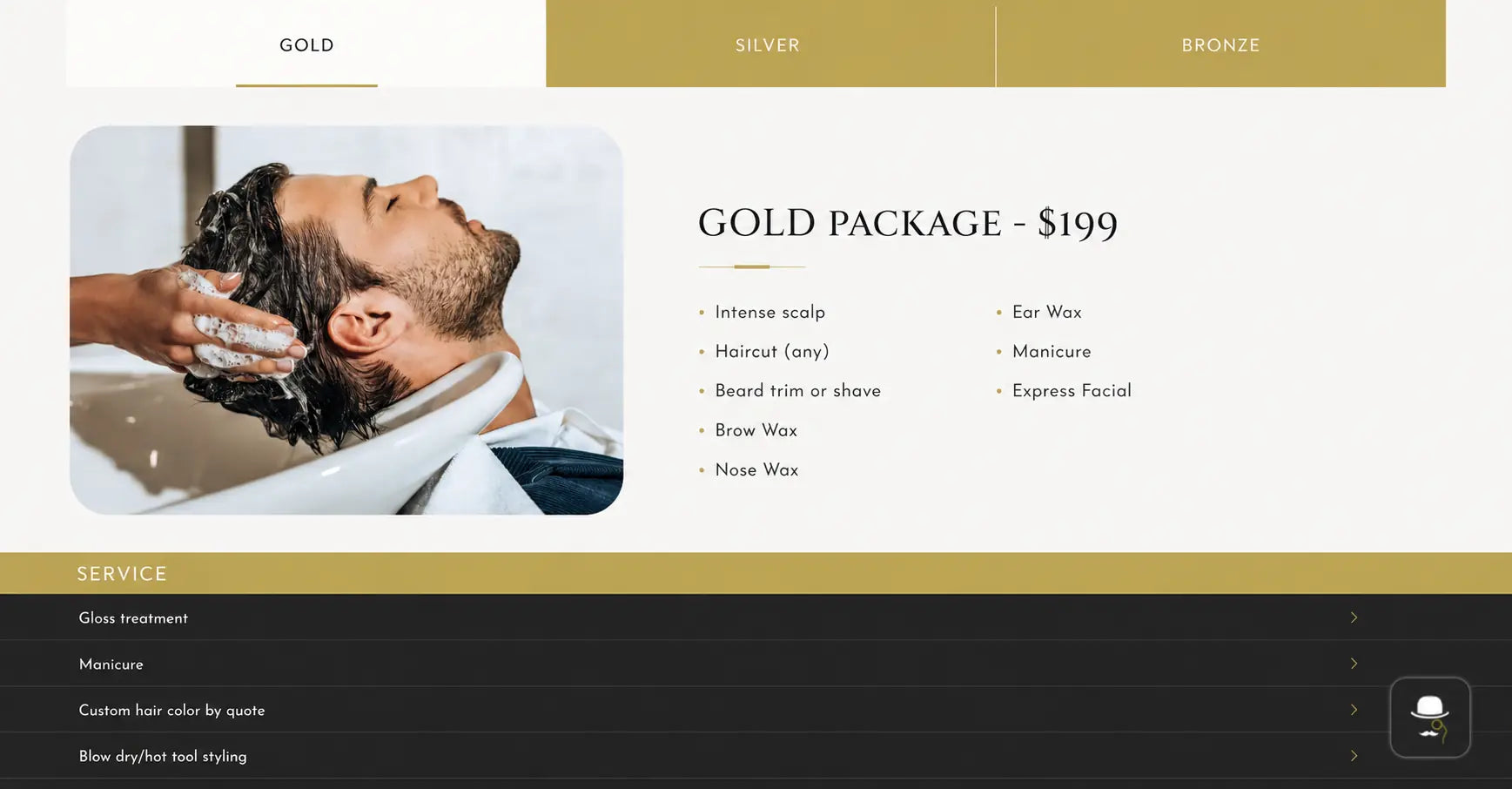
Service packages named Gold, Silver, and Bronze, not Standard, Premium, Deluxe. The naming convention extends the brand vocabulary into the commerce layer. Gold package headers use a warm gold background that references the accent color throughout the site.
"Book Now" as the only CTA
One call to action, present in the top-right nav on every page. No secondary CTAs competing with it. The entire site is architected to make "Book Now" the inevitable next step, not one of several options.
Services as editorial content
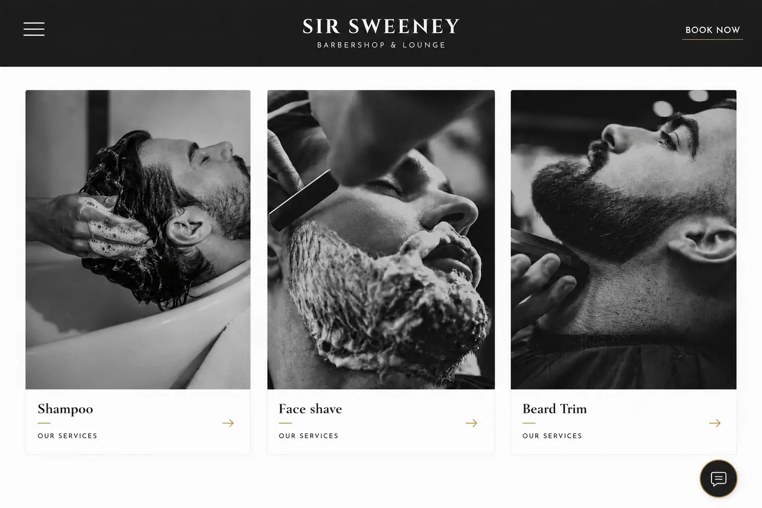
Shampoo. Face Shave. Beard Trim. Each presented with a full-height black and white photograph, a gold rule, and an arrow. Not a price list, a menu. The visual treatment makes every service feel considered, which is exactly what a $199 Gold Package requires.
The work.
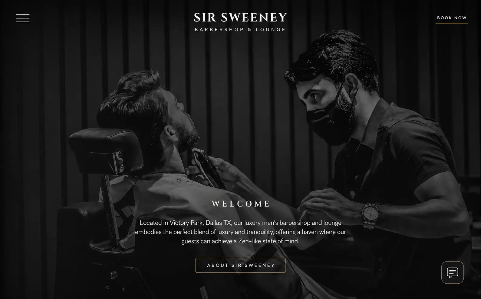
Welcome section, Victory Park, Dallas TX
Full-bleed cinematic barbershop photography, centered copy overlay
Services section, Editorial three-column layout
Black & white macro photography, gold accent rules
Gold Package, $199
Tiered service system with gold / silver / bronze naming, full service breakdown
A brand that feels as considered as the cut.
Brand identity built from zero
Wordmark, color system, typography hierarchy, and tone of voice, all established before a single page was designed. The brand had coherence before it had a website.
Photography direction defined the visual world
Black and white macro craft photography became the visual signature of Sir Sweeney. That direction gave the brand an immediately recognizable aesthetic across site, social, and print.
Booking experience as the north star
Every section, every image, every CTA was designed to reduce the distance between discovery and booking. The site doesn't entertain, it converts.
These images reflect the website at the time of delivery by Bareblink Studio. The live site may have been updated by the client since project completion. Any changes beyond this point were made independently.
Let’s scope yours.
Tell me about your project and you will get a preliminary range in a few minutes, with no call required first.
Get a quote