Love Sienna Rose
Luxury that doesn't just look good. It feels it.
A deeply intentional brand needed a digital world to match.
Love Sienna Rose is a London luxury label built around a single belief: that everyday objects should carry meaning. Every candle is hand-poured with ethically sourced crystals. Every jewellery piece is designed to carry energy, tools for clarity, manifestation, and renewal, not decoration.
They had none of the infrastructure to communicate that digitally. No site, no brand system, no photography direction. What they had was a philosophy, and a product that genuinely lived it.
The brief was total: build the brand identity, direct the photography, and design a site that made "luxury that feels" legible before a customer read a single word of copy.
The challenge
- Positioning a wellness brand as luxury. Crystal candles and intention-setting jewellery occupy a saturated, often cheap-feeling market. The brand identity, photography, and site all had to signal premium before the product did.
- Two product categories, one brand world. Candles and jewellery are different purchase decisions with different customer mindsets. The site had to serve both without splitting the brand's identity or fragmenting the experience.
- Making gifting a core pillar. Love Sienna Rose's black box packaging, ribboned, considered, dressed for the occasion, is as much a product as what's inside it. The gift-ready positioning had to live in the site architecture, not just the copy.
- Photography direction from scratch. The label had no brand imagery. Every styling decision, the black velvet jewellery boxes, the striped backdrops, the in-context candle shots, was established as part of the brand system before a single product photo was taken.
My role
Building the complete brand world, photography direction, and e-commerce site for a London luxury candle and crystal-infused jewellery label rooted in intention and ritual.
Three disciplines. One world that feels like it's always existed.
Black nav, white site
A black navigation bar sits above a clean white canvas throughout. This single structural decision anchors the brand's dual identity, the darkness of the product packaging and the lightness of the ritual-wellness world it lives in. Dark and light in permanent conversation.
Named products as brand voice
The Healer Candle. The Success Ring. The Protection Necklace. The Power Earrings. Product naming is brand strategy. Every name in the Love Sienna Rose catalogue carries intent, it tells the customer not just what they're buying but what it's for. That naming system was established as part of the branding phase.
Gifting as architecture, not copy
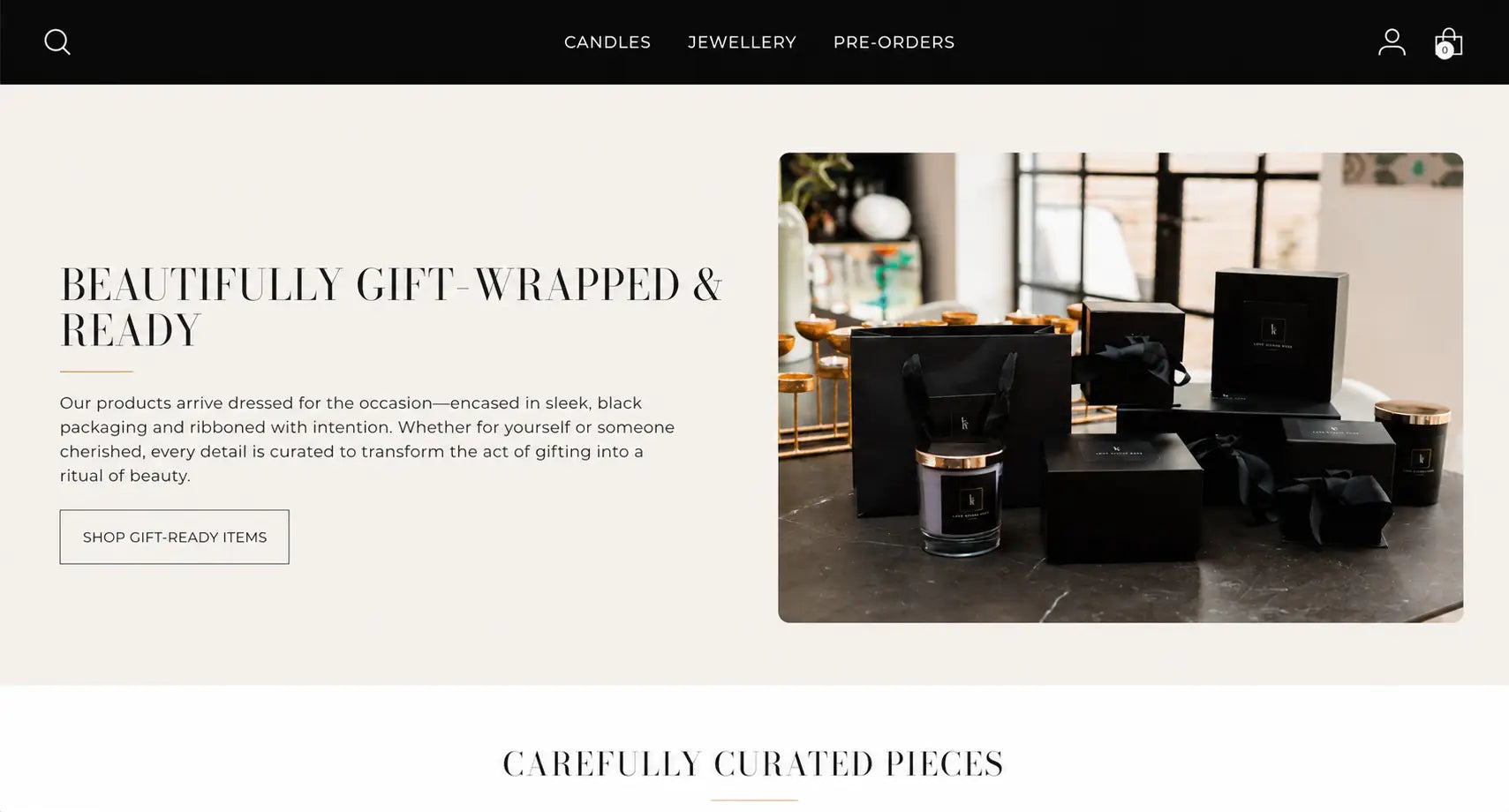
"Beautifully Gift-Wrapped & Ready" is a full homepage section, not a footer note or a banner. Split layout: headline and copy left, full-height packaging photography right. The black boxes, ribbon, and bags are presented as a design decision worthy of editorial treatment, because they are.
Photography direction: context over white ground
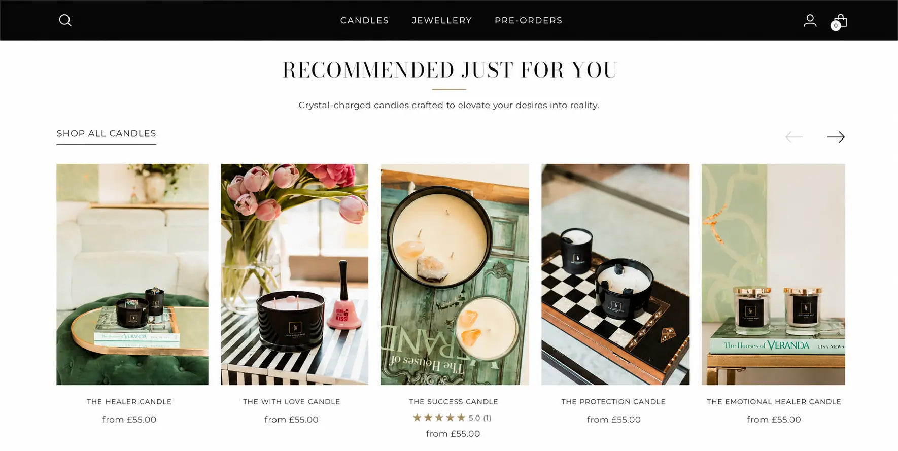
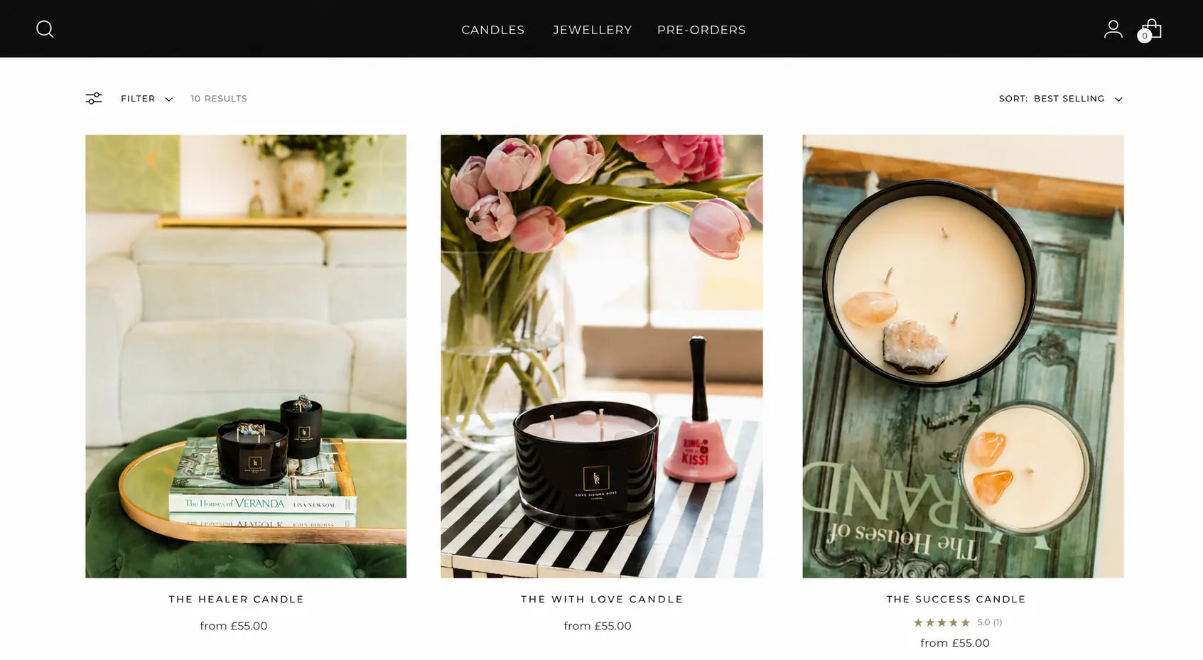
Rather than product-on-white photography, the direction called for lifestyle context: candles on velvet ottomans, beside tulips, on striped surfaces. Jewellery in black velvet boxes with wildflowers. The photography communicates the world the product lives in, which is how you sell a ritual, not a product.
LSR monogram mark
The LR monogram in a gold-bordered square, visible on every product, every candle label, every box. The mark was designed to read at small scale without losing legibility. It anchors the brand identity to the physical product, so every candle in a customer's home is also brand presence.
Brand story as homepage content
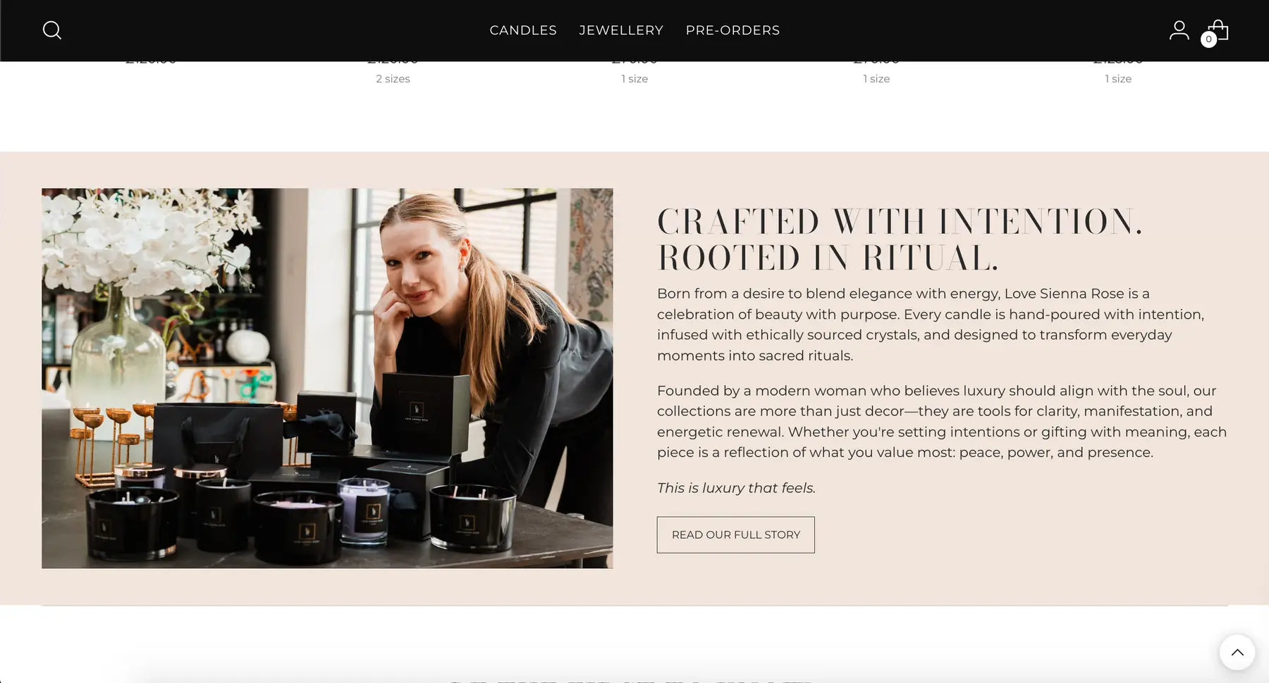
"Crafted with Intention. Rooted in Ritual." sits as a homepage section, founder portrait left, philosophy right. This isn't an About page buried in the nav. It's on the homepage because the brand's story is its strongest conversion tool. A customer who understands why Love Sienna Rose exists is already halfway to buying.
The work.
Recommended Just For You, candle carousel
In-context lifestyle photography, named products from £55
Gift-Wrapped & Ready, homepage section
Black packaging editorial, split layout, gifting as architecture
Candles collection, lifestyle photography grid
In-context product shots from £55, named product system
Jewellery collection, black velvet box photography
Crystal-infused pieces £70–£125

Crafted with Intention. Rooted in Ritual., founder section
Split portrait layout, brand philosophy copy
A brand that earns trust before the product page loads.
Brand built before the site was
Identity system, product naming convention, monogram mark, and photography direction all established in the brand phase. The site had a complete world to express before a page was designed.
Photography as brand infrastructure
The in-context lifestyle photography direction, velvet, wildflowers, striped surfaces, black velvet jewellery boxes, became the visual signature of the brand. Immediately recognisable across site, social, and print.
Gifting positioned as a pillar
The black box packaging elevated to homepage editorial content. Gift-giving became a reason to visit the site specifically, not just a checkout option.
These images reflect the website at the time of delivery by Bareblink Studio. The live site may have been updated by the client since project completion. Any changes beyond this point were made independently.
Let’s scope yours.
Tell me about your project and you will get a preliminary range in a few minutes, with no call required first.
Get a quote