Gaia’s Roots
Where nature meets the room it belongs in.
Global designer furniture needed a home as considered as its pieces.
Gaia's Roots is a global luxury furniture platform carrying some of the world's most iconic and exclusive designer pieces, from $3,900 side tables to $10,200 burl wood coffee tables. Biophilic design, natural materials, architectural forms.
They had no site, no digital strategy, and no system for communicating the breadth of their catalogue without it feeling like a warehouse. The challenge was building something that felt as curated as the collection itself.
With web design and brand strategy both in scope, every decision, from navigation architecture to editorial framing to the way categories were named, was made to serve the same goal: make the right client feel like they've found the right place.
The challenge
- Catalogue depth without overwhelm. Gaia's Roots carries hundreds of pieces across seating, tables, lighting, bedroom, decor, storage, outdoor, and more. The navigation had to be comprehensive without feeling like a directory.
- Price point justification at scale. Pieces priced $3,900–$10,200+ need a site that makes the investment feel inevitable, before a customer ever reaches the product page. Photography and editorial framing do that work.
- Biophilic brand positioning. The brand's entire identity is rooted in nature, organic materials, architectural forms, living with intention. The site's visual language had to embody that without becoming decorative or clichéd.
- Multi-brand editorial architecture. Gaia's Roots carries pieces from multiple global designers, each with their own story. The "Behind the Brand" sections needed to live within a coherent system without diluting Gaia's own identity.
My role
Building the digital world for a global designer furniture platform where every piece is iconic, exclusive, and rooted in the organic.
Strategy shaped the structure. Design made it feel inevitable.
Full-bleed architectural hero
The hero runs edge-to-edge with architectural furniture photography, concrete walls, warm tones, natural light. The headline "For Refined & Character-Rich Interiors" sets the brand positioning before a category is clicked. It's a statement, not a welcome.
Editorial section headers as brand voice
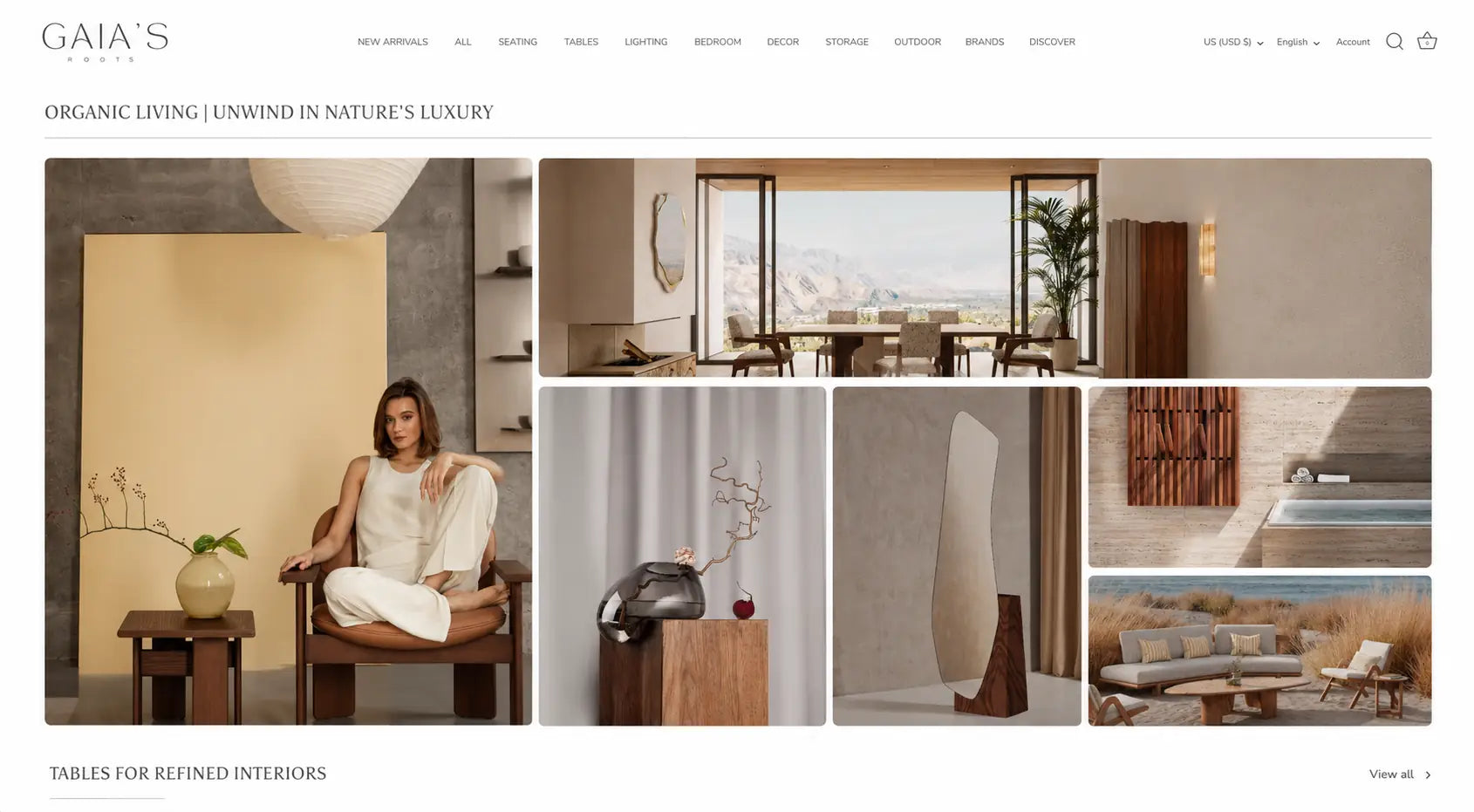
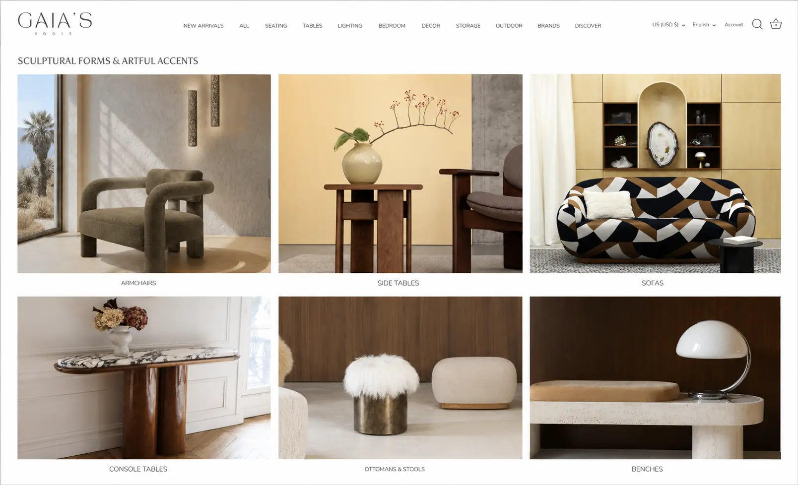
"Organic Living | Unwind in Nature's Luxury." "Sculptural Forms & Artful Accents." "Eccentric Fabrics | Wild Textures & Bold Prints." These aren't category labels, they're editorial headlines that make browsing feel like reading a magazine.
Masonry grid for lifestyle imagery
The editorial sections use an asymmetric masonry layout, one large portrait image alongside smaller landscape sections. This creates the visual rhythm of a shelter magazine and prevents the page from reading like a product catalogue.
Category architecture as wayfinding
New Arrivals, All, Seating, Tables, Lighting, Bedroom, Decor, Storage, Outdoor, Brands, Discover. Eleven nav items that tell the full story of the catalogue without requiring a landing page to explain it. "Discover" positions Gaia's Roots as a destination, not just a store.
Behind the Brand system
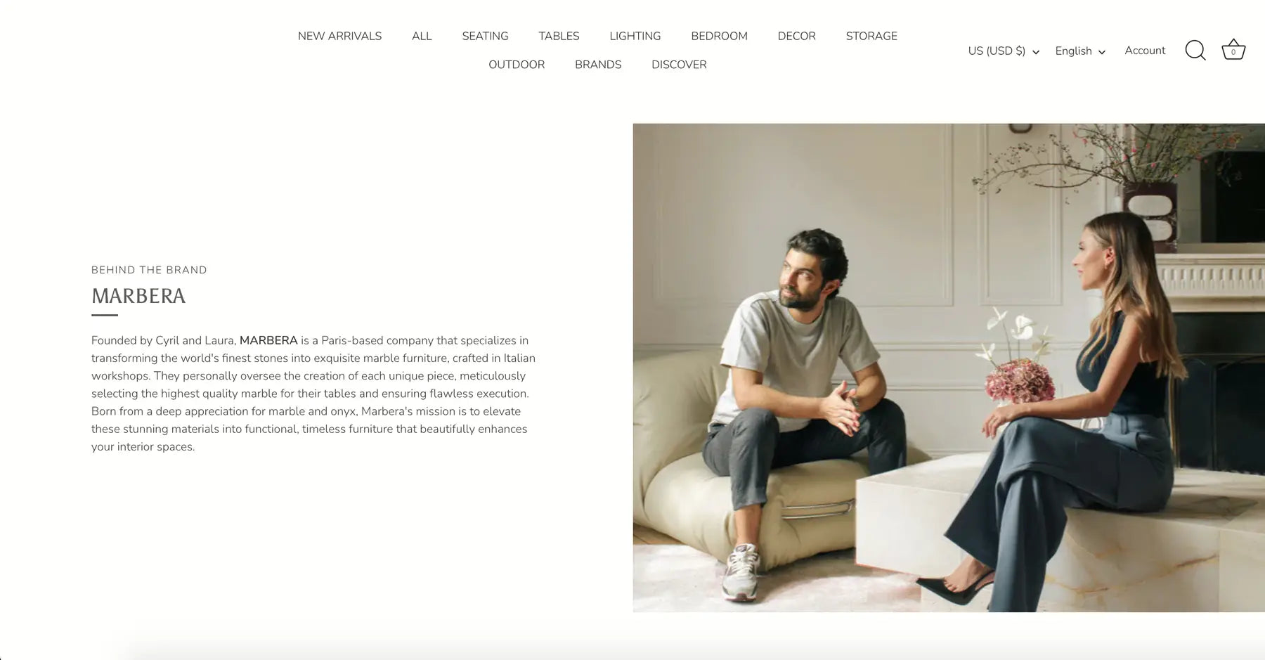
Each designer partner gets a dedicated editorial feature, text left, portrait photography right, hairline rule between name and story. A reusable template that gives every brand their moment without disrupting the platform's own visual identity.
Neutral ground for product photography
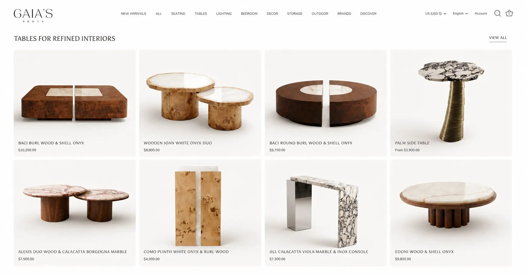
All product grids use a near-white ground with generous padding. When pieces cost $3,900–$10,200, the product image needs complete visual isolation. No background competing with a burl wood and shell onyx coffee table.
The work.
Editorial homepage section, Organic Living
Masonry grid storytelling across lifestyle and product imagery
Seating category, Sculptural Forms & Artful Accents
Editorial category headers, contextual photography
Tables product grid, $3,900–$10,200
Clean white ground, generous padding, material-first naming
Behind the Brand, Marbera
Designer partner editorial feature system
A platform that shops like a magazine and sells like a gallery.
Brand strategy before a pixel was placed
Editorial headline system, category architecture, and brand positioning established in strategy phase. Every design decision had a strategic reason before it had a visual form.
Catalogue depth, zero overwhelm
Hundreds of pieces across eleven categories presented through editorial architecture and masonry layouts. Browsing feels curated at every scroll depth.
Price point fully supported
A site that earns $3,900–$10,200 price points on first impression, before a product page loads. The visual environment is as premium as the pieces it sells.
These images reflect the website at the time of delivery by Bareblink Studio. The live site may have been updated by the client since project completion. Any changes beyond this point were made independently.
Let’s scope yours.
Tell me about your project and you will get a preliminary range in a few minutes, with no call required first.
Get a quote