Chinakwe
Wearable art deserved a site that wore it well.
The art had evolved. The site hadn't kept up.
Chinakwe is the brand of UK-based artist and designer Caroline Chi Chi Chinakwe, a practice rooted in African heritage and European upbringing, expressed through bold print styling, saturated colour, and wearable art that carries cultural narrative as its core material.
The brand had grown into something genuinely distinctive, art prints on scarves, wearable statement pieces, homeware, a "Colourism" collection as a standalone world. But the site it had inherited didn't reflect that growth. It looked like a fashion store. Chinakwe is not just a fashion store.
The redesign had to bring the site up to the level of the art, without sanitising what makes the brand bold.
The challenge
- Art brand vs fashion brand positioning. Chinakwe isn't selling clothes, it's selling art you can wear. That distinction is everything. The site architecture had to reflect a practice, not just a product range.
- Colour as a design decision, not a problem to solve. The brand's visual world is maximalist, bold saturated art photography, dense print, high-contrast colour. Most design solutions would have tried to calm it down. The right answer was to hold it with structure, not restrict it.
- "Colourism" as a standalone destination. The Colourism collection isn't just product, it's a statement. A political and cultural act that needed its own page architecture, its own nav presence, its own editorial weight within the site.
- Price point vs perception. Scarves at $202, apparel at $101–$115. The brand is premium. The old site read budget. Every layout decision in the redesign had to close that gap without changing a single price.
My role
Redesigning the digital presence of a UK Afro-Lux art and fashion label whose existing site couldn't hold the weight of what the brand had become.
Structure that holds boldness without flattening it.
Full-bleed studio hero
The homepage opens on an immersive studio photograph, Chinakwe's art prints on the walls, bold textiles across every surface, the brand's full world made physical. "Wearable Art & Statement Living" runs left, large and unapologetic. The hero doesn't introduce the brand, it drops you inside it.
Red wordmark as brand anchor
CHINAKWE in the brand's custom red, centred, persistent, present on every page. Against the cream background it becomes the single most distinctive nav element in the portfolio. It doesn't need size to command attention. It commands it through colour and consistency.
Cream ground as tension device
Every page sits on a warm cream ground, not white, not black. This was a deliberate choice: the neutral makes the saturated art photography land harder. The contrast between the restrained ground and the maximalist product imagery is where the brand's personality lives.
Left-anchored editorial layout
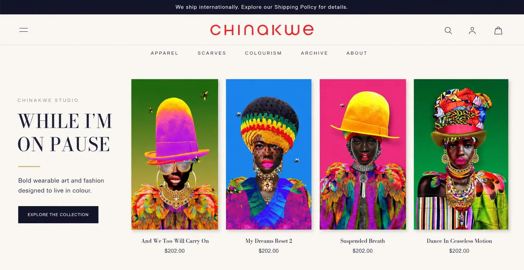
Collection sections use a left-anchored text column alongside a scrolling product grid. "While I'm On Pause. Bold wearable art and fashion designed to live in colour." The text earns space equal to the product. This is how you treat a practice, not a product range.
Colourism as nav-level content
The Colourism collection sits in the primary navigation alongside Apparel, Scarves, Archive, and About. Giving it nav-level presence signals that this isn't a seasonal collection, it's a pillar of the brand's identity. The About nav then frames the whole practice as art, not commerce.
Art. Culture. Style. as brand positioning
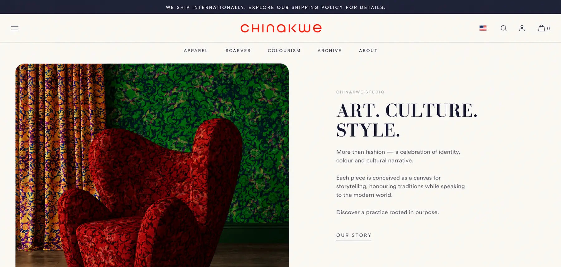
A dedicated homepage section, richly patterned chair and curtain left, philosophy right: "More than fashion, a celebration of identity, colour and cultural narrative." This section does what an About page usually does, but it lives on the homepage, where the right buyer needs to encounter it first.
The work.
While I'm On Pause, scarf collection
Left-anchored editorial headline, saturated art photography grid
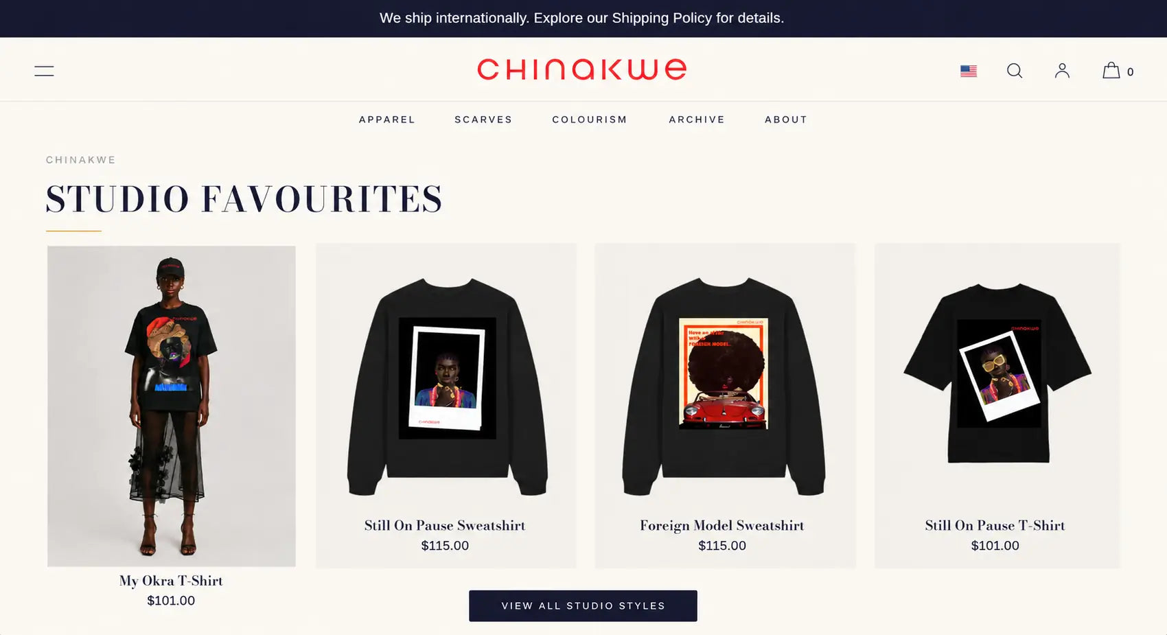
Studio Favourites, apparel grid
Polaroid-print art pieces on black garments, $101–$115
Art. Culture. Style., brand philosophy section
Split layout, patterned textile photography, editorial copy
A site that finally matches the practice it represents.
Art brand positioning achieved
The site architecture, nav structure, editorial sections, homepage hero, positions Chinakwe as a practice first and a store second. That distinction is worth more than any rebrand.
Maximalism held with structure
Bold colour and saturated art photography throughout, contained by a consistent cream ground and disciplined layout system. The energy is preserved, the chaos is not.
Price point gap closed
$202 scarves and $115 apparel now sit in a site that communicates why. The editorial framing, the Colourism nav category, the brand philosophy section, all of it makes the investment feel considered before a product page loads.
These images reflect the website at the time of delivery by Bareblink Studio. The live site may have been updated by the client since project completion. Any changes beyond this point were made independently.
Let’s scope yours.
Tell me about your project and you will get a preliminary range in a few minutes, with no call required first.
Get a quote